Visible Language
In the summer before my final year of graduate school, I was invited to design two issues of Visible Language, the oldest peer-reviewed design journal. Each issue would focus on Fluxus with the first featuring articles on its legacy in historical context and the second how several artists see the Fluxus legacy and their role in it.
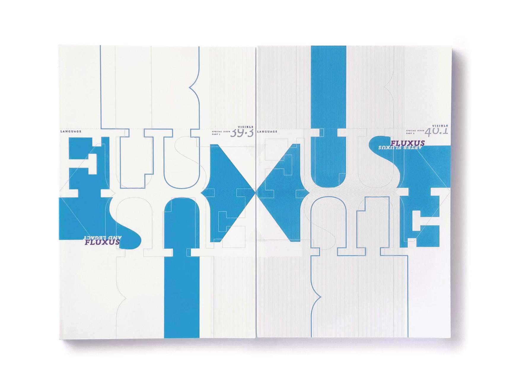
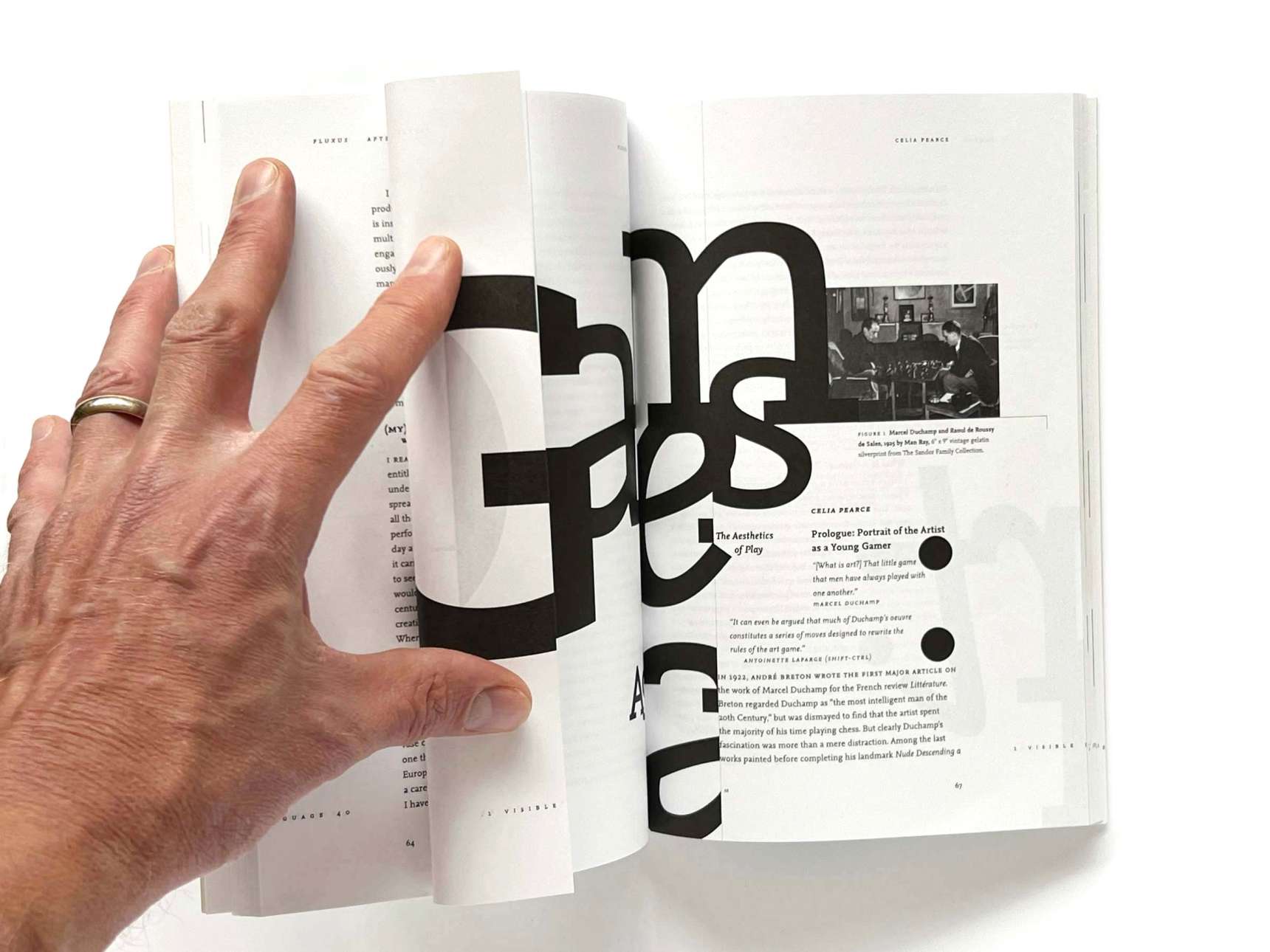
After researching Fluxus and reading the articles submitted for publication, themes of playfulness and experimentalism and the unity of art and life came to mind. I wanted each journal's design to invite readers to engage with the content and with the published journal as an object.
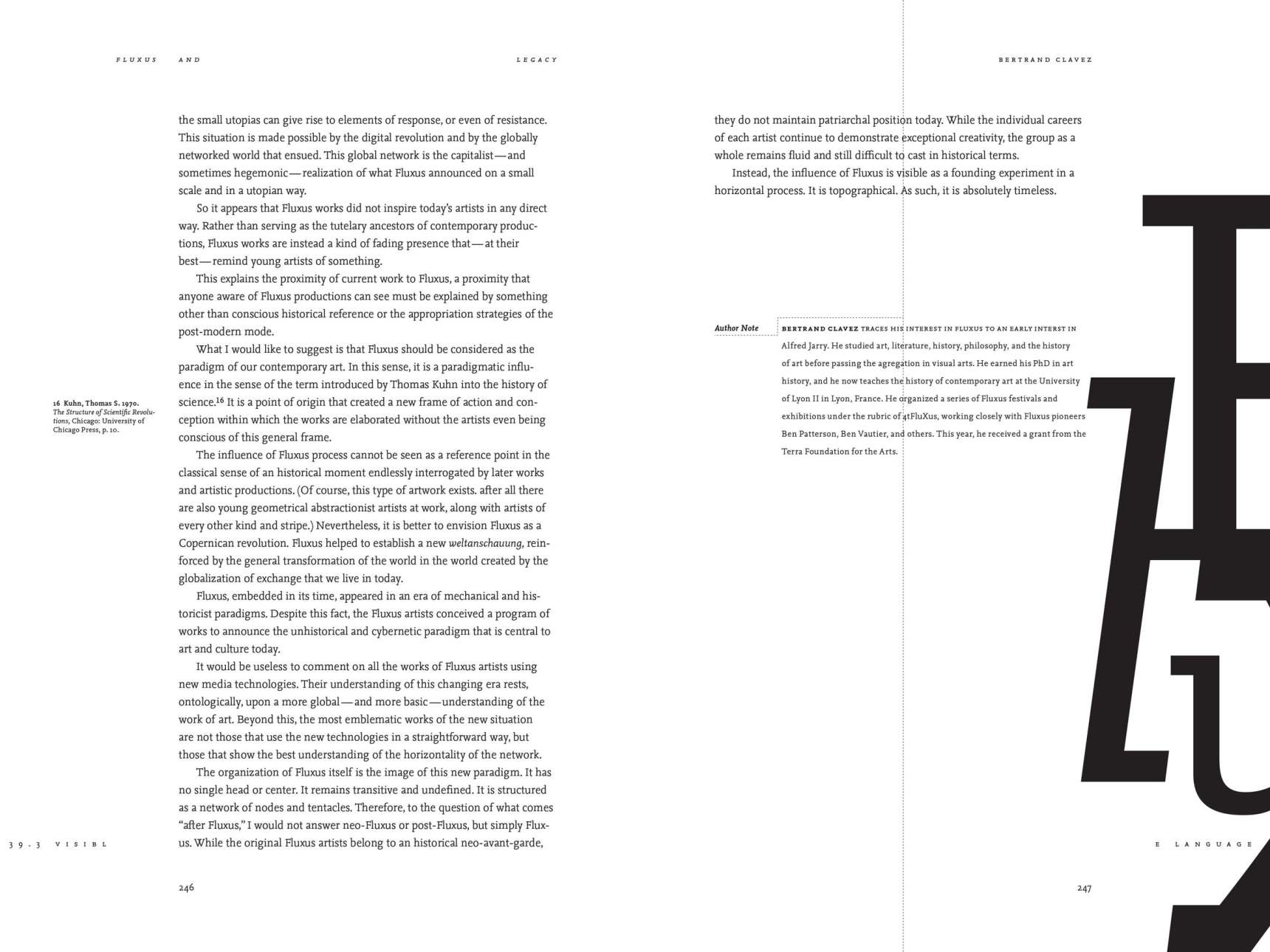
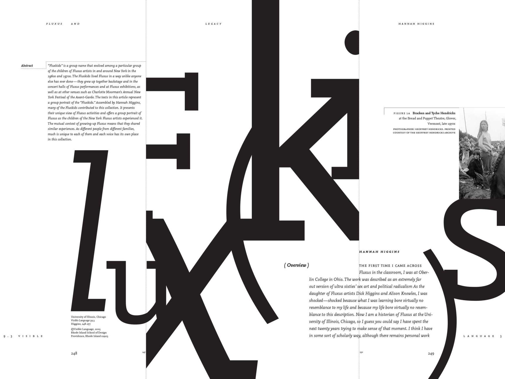
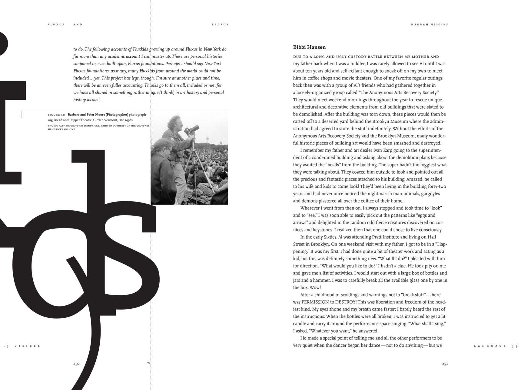
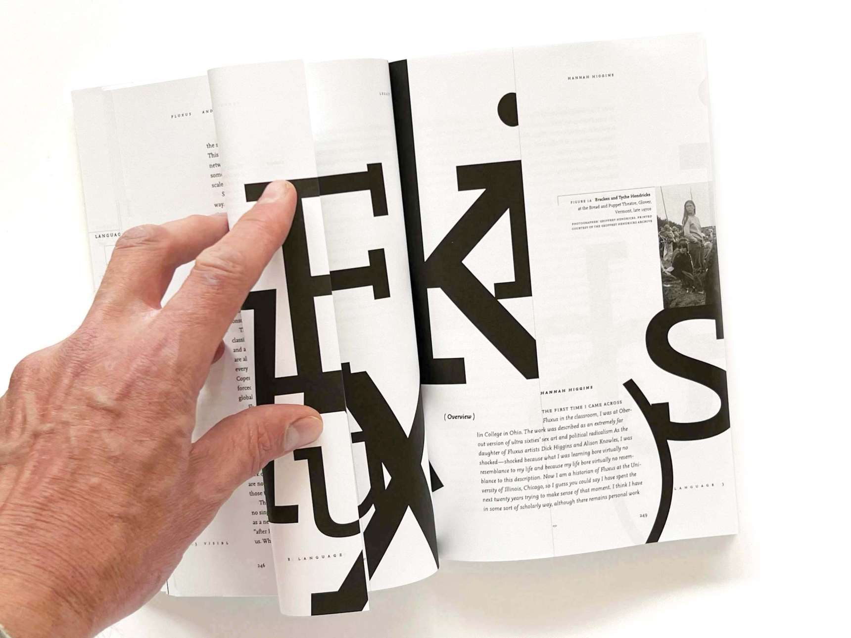
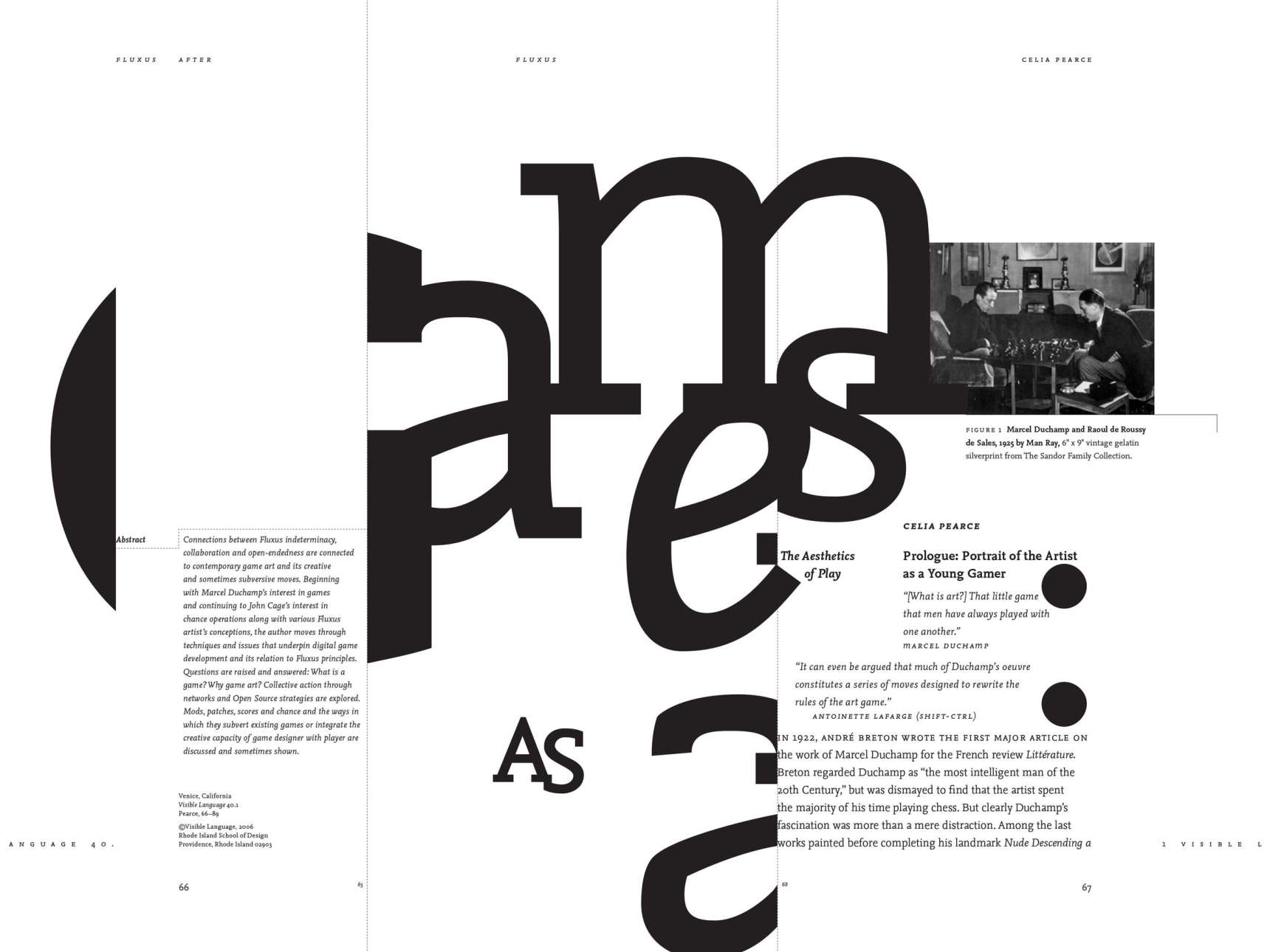
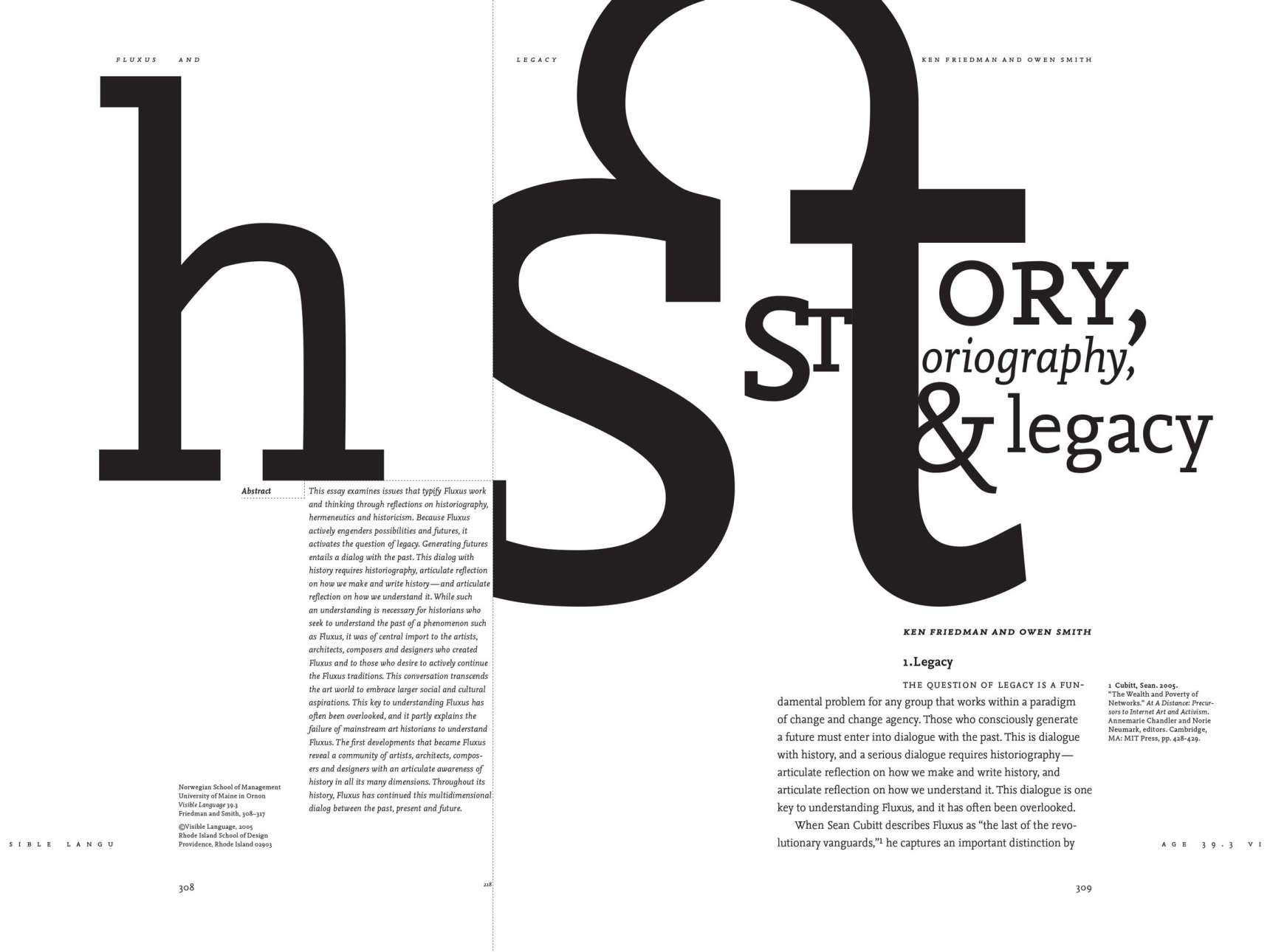
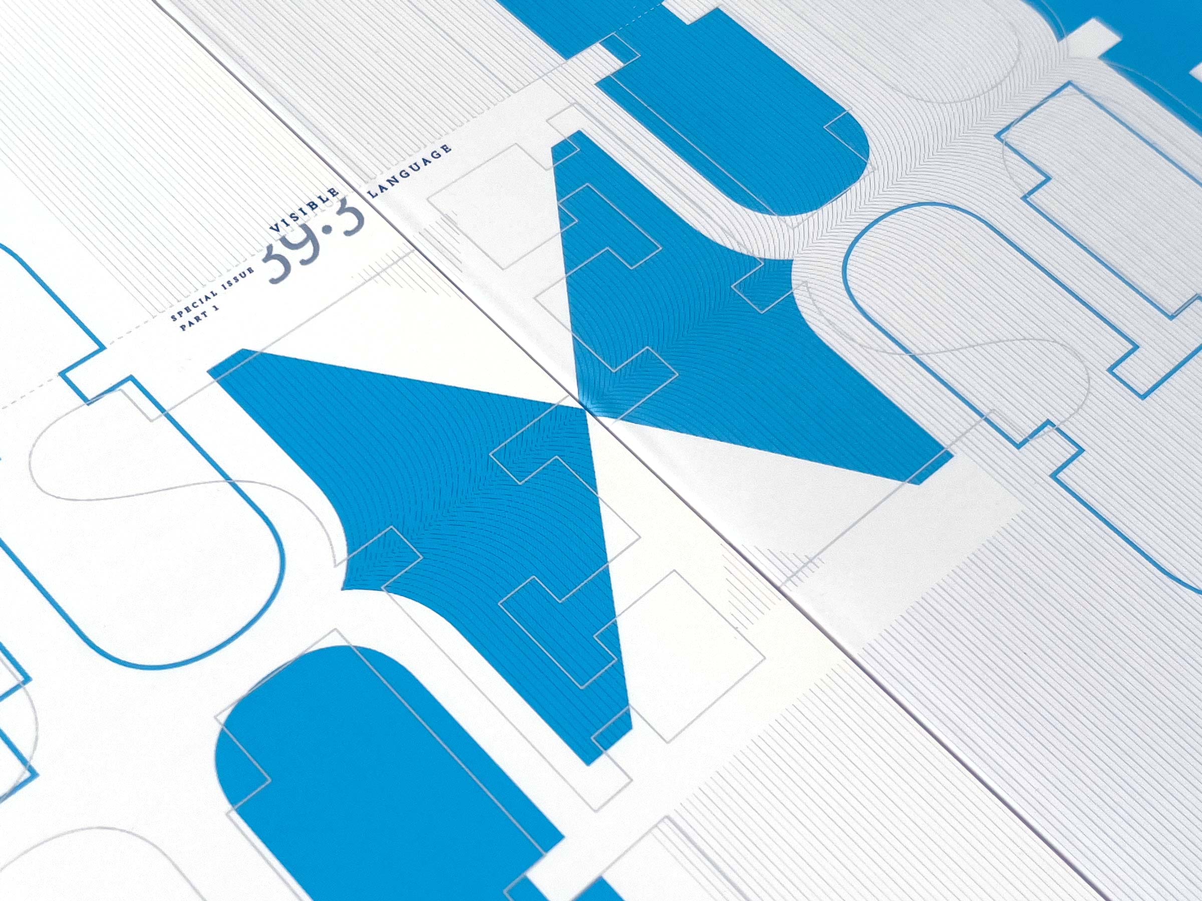
As an academic journal, the design couldn't be too experimental, but each article's opening was an opportunity to invite the reader to fold or turn pages to complete each article's headline. Subtle lines and page numbers provided clues. The journal name in the page footer could only be read in full as the reader flipped through the pages like a flip book to see the type animate from cover to cover. Finally, the covers of each issue used elements that were a flipped copy of the other issue and when put together, spelled Fluxus.