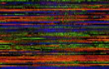
Winds.Process.2016.01
As of March 2016, I had collected data on 383 days in eight locations around the country. Curious about the variations between locations and time of year, I developed this process to see the differences. Each drawing’s horizontal strip is a mini-timeline showing wind conditions over one day. Color is mapped to wind direction with winds from the north in blue and the south in red. Brightness is keyed to wind speed. In the drawing generated with data from Boone in 2016, some data loss occurred in February, resulting in empty rows in the drawing.


