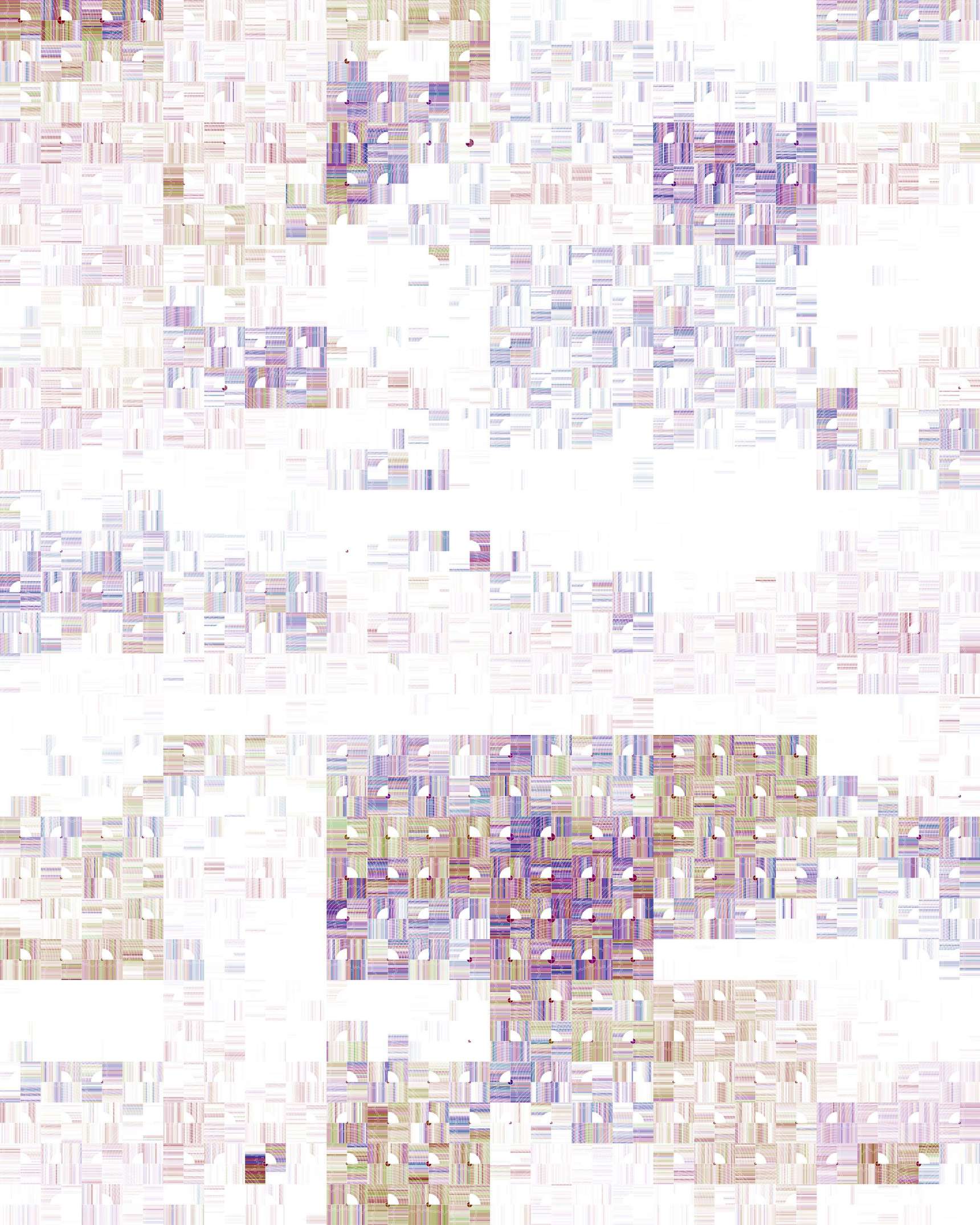
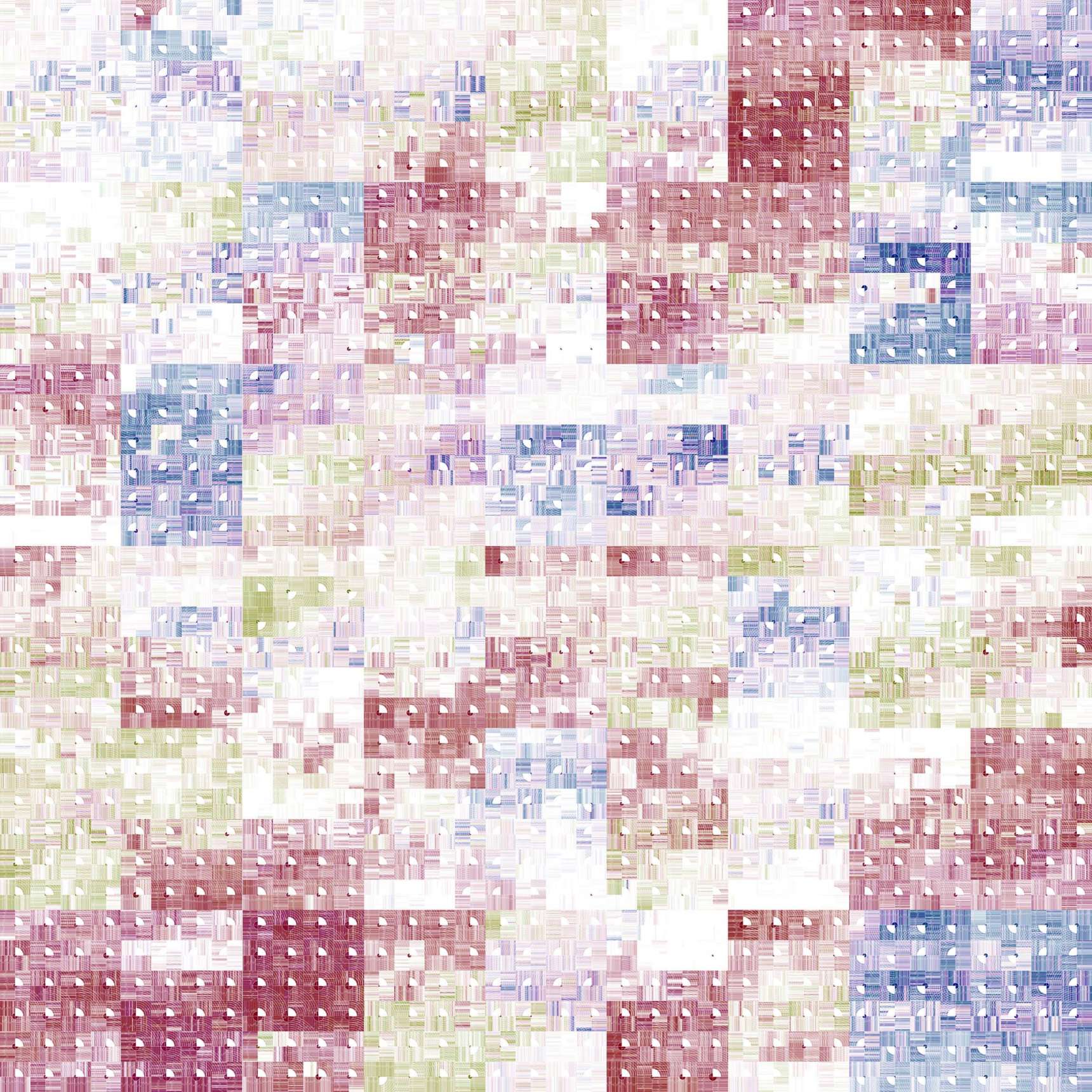
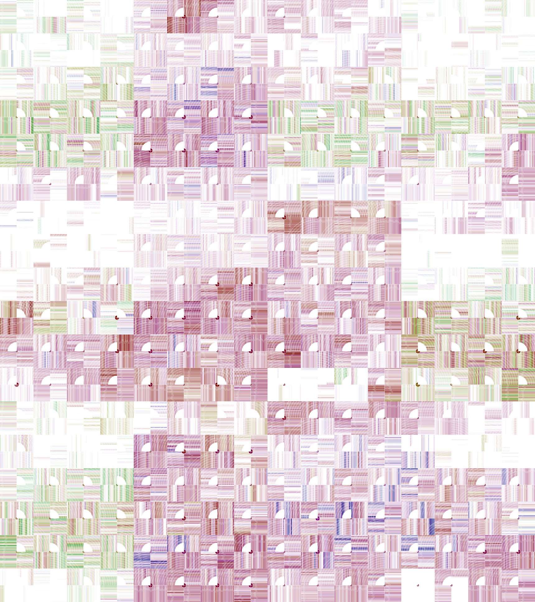
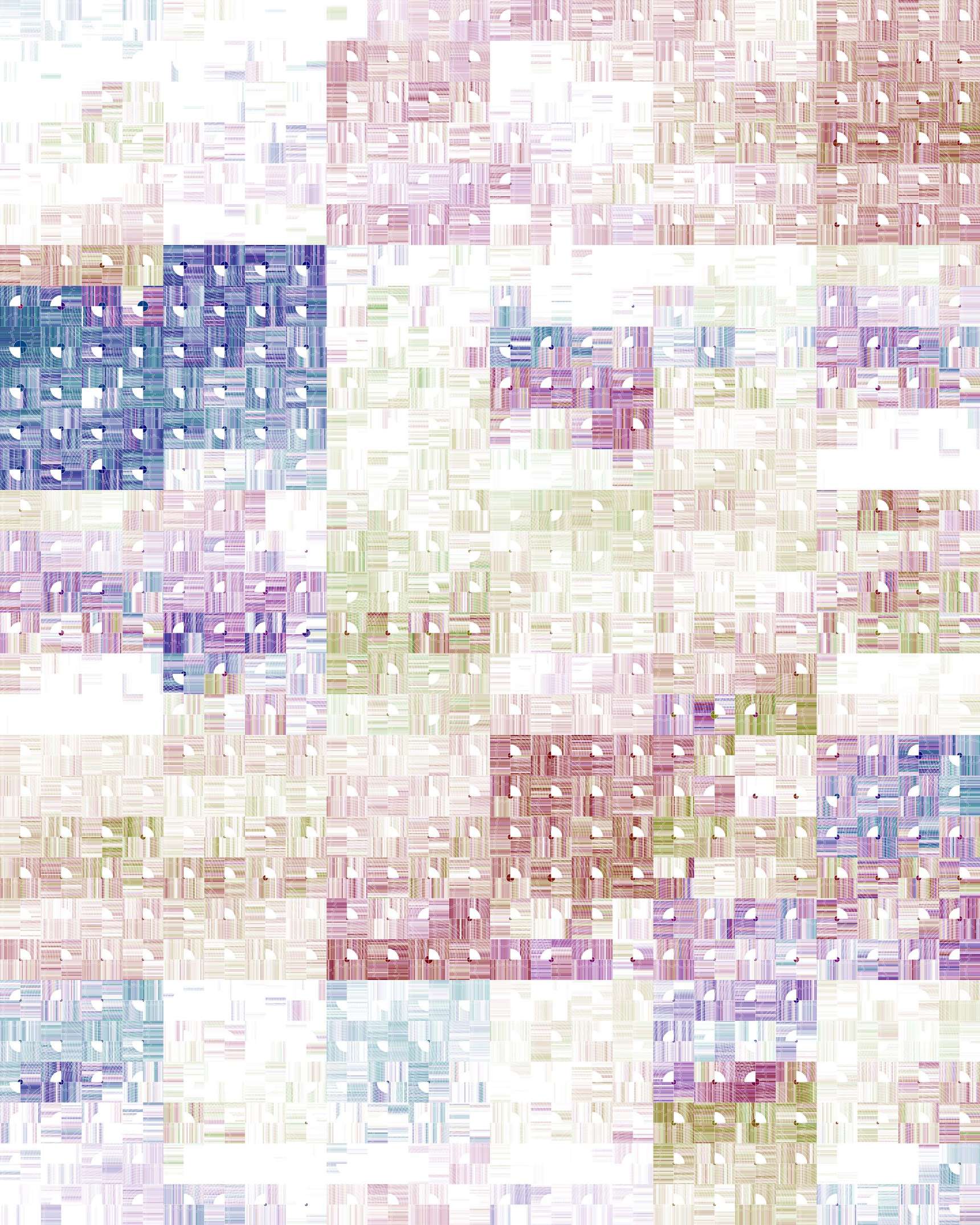
Winds.Process.2014.02
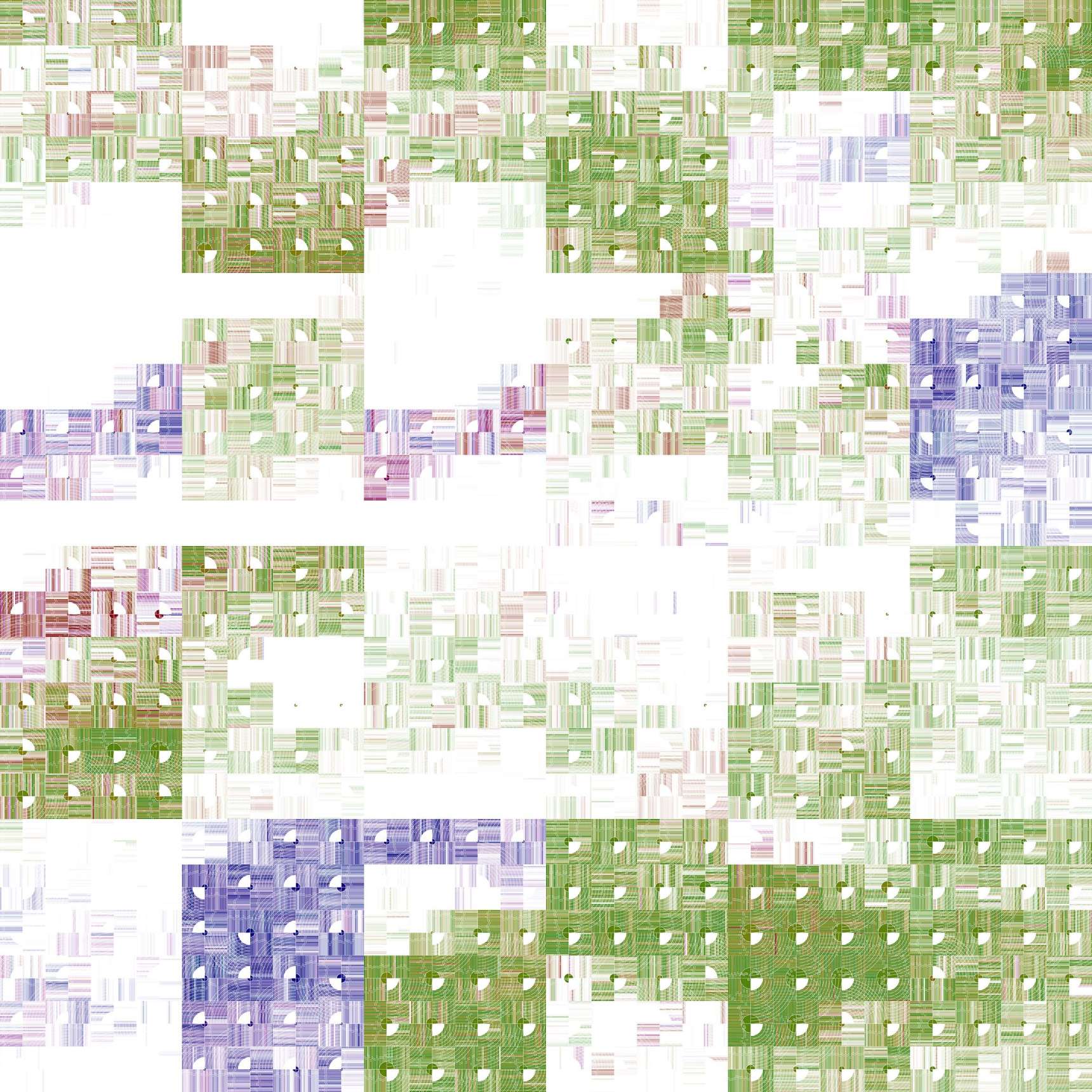
This drawing process interprets wind conditions at one location for more than one day and makes marks for each datum of the data set. With data collected at a rate of once per second and each day having 86,400 seconds, I saw great potential for a complex drawing.
Each drawing with this process uses a grid of large rectangles that have their own 4x6 grid of 24 squares. The larger rectangles show wind conditions for a day and each of the 24 squares shows wind conditions over an hour. The larger rectangles are organized chronologically, starting at the top-left and moving to the right. In every other row, they are placed from right to left. Each drawing has a boustrophedon-like flow.
Within each larger rectangle’s hourly square, stripes show average wind conditions for a minute. A small box (scroll to see detail images) in each stripe shows average wind speed over that minute. Thin white lines show wind conditions for each second of that minute with their length relating to wind direction and opacity to speed.
In the center of each hourly square, a color circle shows the hour’s average wind speed and direction. A white quarter-circle with radiating arcs shows the general direction the wind was blowing toward. With each drawing, color is keyed to wind direction and density to wind speed.